Project
Gryfin
Visual Identity
Creative Storytelling
Details
Structure, energy, and clarity — turned into a visible identity
Client
Gryfin Labs
Year
2024
Timeline
5 Weeks
Tags
Packaging System
Used Tools
Figma
Illustrator
Notion
Blender
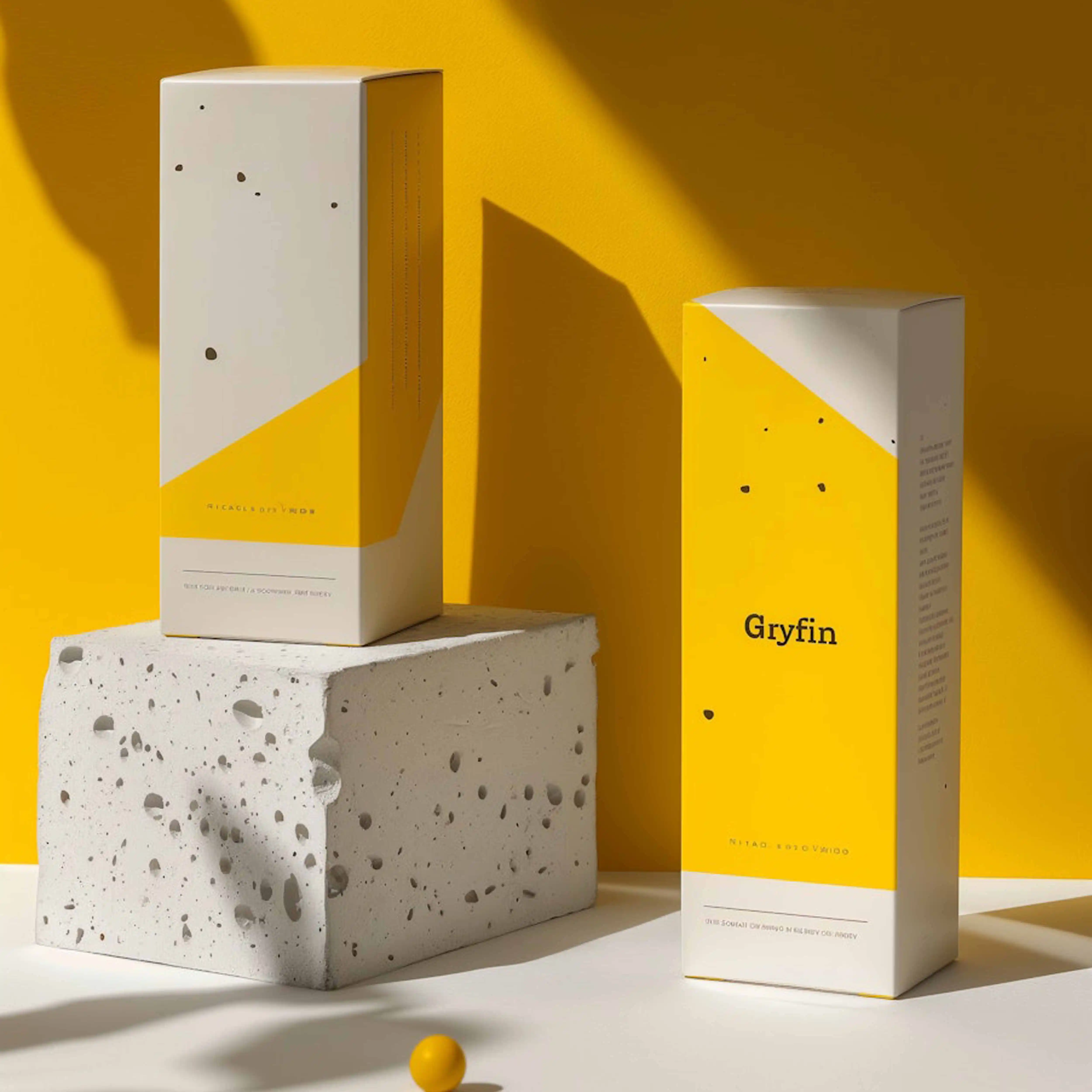
A bold brand for a focused supplement line — built on rhythm, weight, and restraint.
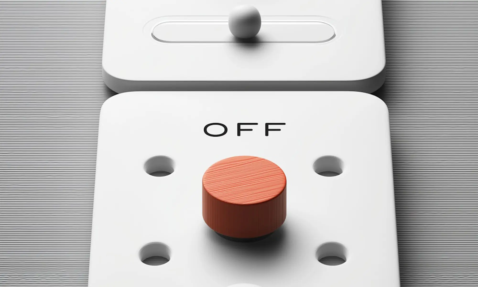
Gryfin is a wellness concept for those who value clarity over hype. The identity embraces contrast: industrial calm meets structured typography. Yellow acts as a visual anchor — full of energy but held in balance by gray and concrete tones.
The packaging system follows a rhythm of alignment and weight. Labels use a typographic scale inspired by scientific notations, creating a sense of order and control. Everything serves function — but with texture and thought.
Rather than overwhelm, Gryfin’s brand creates space: space to pause, to choose, to act. It’s a quiet confidence made visible.


No items found.